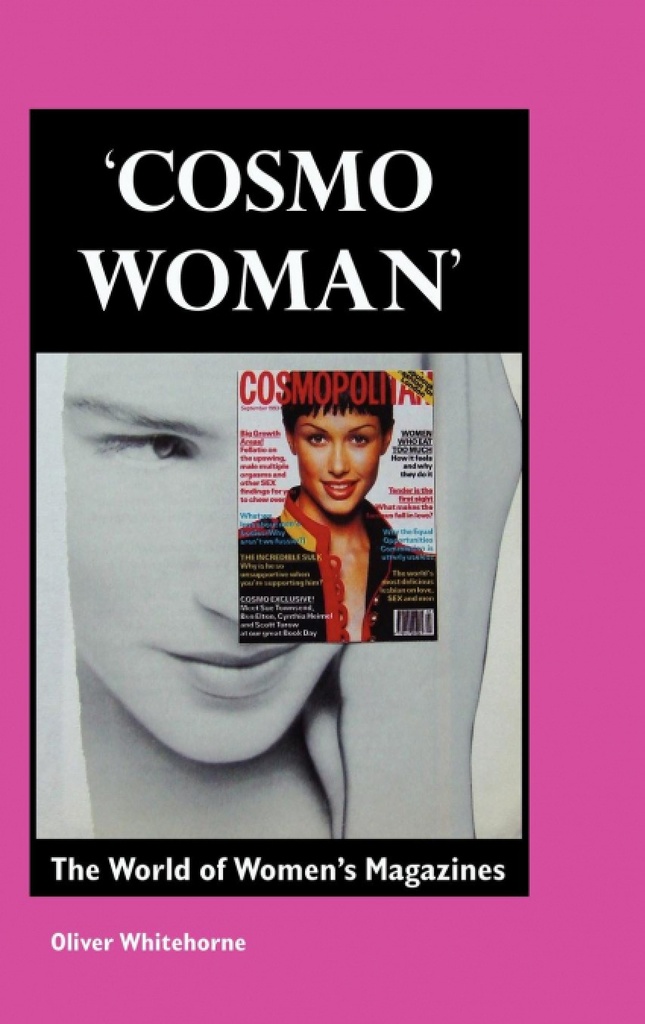
COSMO WOMAN This is one of the few full-length explorations of the ´women´s magazine´ market. Focussing on Cosmopolitan magazine, Oliver Whitehorne considers every aspect of the women´s magazine, from themes and issues to images and style. The feminism in women´s magazines is discussed in detail, and is related to second wave feminism and third wave or ´postmodern´ feminism. As well as Cosmopolitan, the author also studies many other magazines in the women´s magazine market, and related magazines, such as lifestyle magazines and men´s magazines. The author looks at the use of advertizing and consumerism in women´s magazines and other lifestyle and consumer magazines, drawing on many examples of ads which are deconstructed in detail. EXTRACT FROM CHAPTER TWO, ´THE COSMO WOMAN´ Let´s start with the typical front page of Cosmopolitan. As with most other women´s magazines, Cosmopolitan features a woman, a model, smiling. It´s not a movie star, or someone with a name (the model, we see inside, is called ´Rohini´. Models/ supermodels are known by their first names: Naomi, Claudia, Kate). The imagery of the woman is ´positive´, ´exuberant´, ´young´, ´tanned´, ´smart´, ´in control´, ´self-confident´. The photographs on the covers of women´s magazines speak of healthy living, clean-washed clothes, where white is truly sparkling white. Teeth are perfect. There are no wrinkles or unsightly flabby bits of skin. The models´ skin is blemishless. Jewellery is perfect and there are no ´bad hair´ days for cover stars. This woman is nameless but she is also ´Cosmo woman´, centrepiece of the image chosen to sell this month´s issue of the magazine. The model is selected to portray the mood and aims of the magazine, and to leap out of the other magazines on the racks. She is, of course, also the mirror of the audience, but a stylized, idealized mirror. The cover of Cosmo shows the would-be buyer and audience what they could be like. It is a piece of advertizing, the magazine cover. It invites the browser into the world of the magazine. It has to make a direct and instantaneous appeal to the potential buyer. Booksellers know that the most important aspect of a book´s sales potential is its cover. Magazines have developed cover design to a refined artform, and each magazine has its house style, its code of subtle laws that consumers read in a very sophisticated manner. There may not be much to read on the cover, but it takes a while to really explain and understand the significance of every aspect of a cover. Like a movie poster or a burger bar menu, a magazine cover is a highly stylized product (physical details of the magazine cover include type size, shape and colour, size and texture of paper, the sell-lines, the lay-out, it´s also crucial where the magazine is displayed - high or low, or next to particular magazines).

